Case study / Tourism
Website for a tour company in Madeira
EBoard Madeira · Digitais Studio · Funchal · Madeira
Summary
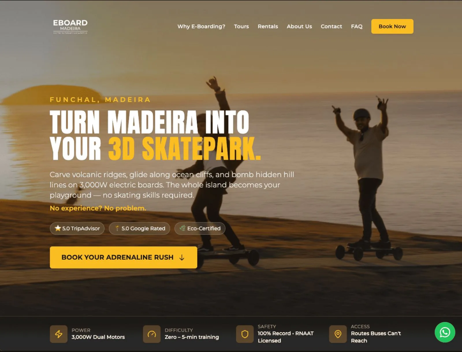
EBoard Madeira runs tours and needed a website that explained the experience and captured booking requests. Digitais Studio defined the page structure, wrote the content, and built the site with the booking request as the main action.
Context
A tourist decides in a few minutes, often already on the island and on their phone. If they don't quickly understand what the experience is, how long it takes and how to book, they look for something else.
The competition isn't just other tour operators: it's everything else that appears in the same search, including booking platforms with ready-made pages that rank very well. A company's own website only earns its place if it explains the experience better than a generic listing.
There was also the question of language. Much of the audience searching for this kind of activity in Madeira doesn't read Portuguese, and the copy had to work for people who don't know the island or the brand.
A tour company also lives with seasonality and timing: conditions change, schedules change, and outdated information costs bookings.
There was also an expectations problem. An outdoor activity attracts people with very different levels of experience, and most drop-outs happen because of a mismatch between what was imagined and what the activity actually is.
Approach
How I did it
We structured each tour as an answer: what it is, how long it lasts, what's included, who it's for and what to bring.
We wrote the content for people arriving from search who don't know the brand, without assuming any knowledge of the island, the locations or the activity's vocabulary.
The constraint that mattered most was the reading context: someone on the move, on a phone, with patchy connectivity. That pushed the site towards light pages and short blocks of information, readable without zooming.
We kept the booking request always visible, with no unnecessary steps and no requirement to create an account.
We connected the site to analytics at launch, so the company would know where booking requests were coming from.
We clearly separated what's fixed from what changes, so schedule or condition updates wouldn't require touching the page design.
We wrote each tour's requirements in plain language, including the physical demands of the activity, to align expectations before booking.
What I delivered
Page structure and written content
Responsive website with booking request
Tour pages with duration, inclusions and requirements
Baseline technical SEO and analytics integration
Result
What changed
The company now has its own booking channel, instead of depending only on third-party platforms.
The questions that came up repeatedly before booking, duration, what to bring, required level, are now answered on the page itself.
The written content became reusable in the descriptions the company keeps on other platforms.
The company stopped answering the same questions about duration and requirements by message, because they're now on the page.
Schedule changes are now made in text, without relying on new graphic production.
This project is mostly Websites work. That page explains what it includes, how it works and what gets delivered.
Want work like this?
Tell me what you need. We talk for 20 minutes, I understand the scope and send you a fixed quote.
Diogo Gomes, Creative Direction · Updated on 17 October 2026
5.0 · 15 reviews on Google