Case study / Personal brand
Visual identity and presentation website
PLA Eventos · Digitais Studio · Funchal · Madeira
Summary
PLA needed a complete visual identity and a website to present it. Digitais Studio created the logo, palette, typography and usage guidelines, and built a long-form website focused on conversion.
Context
A personal brand presenting itself to potential clients needs to look consistent across every touchpoint. Without a visual system, every piece looks different and the brand loses strength.
The problem gets worse when the person producing the material is the brand owner themselves. Without written rules, every presentation, proposal or post is a fresh decision, and decisions made in a hurry never match each other.
The goal wasn't a logo. It was a system small enough to be used without help and defined enough to leave no doubt about what's allowed.
A personal brand has a particular challenge: it can't look like a company. If the visual system is too corporate, it loses exactly what makes it the chosen option.
So the work was as much about definition as restraint, deciding what the brand does and, above all, what it stops doing.
Approach
How I did it
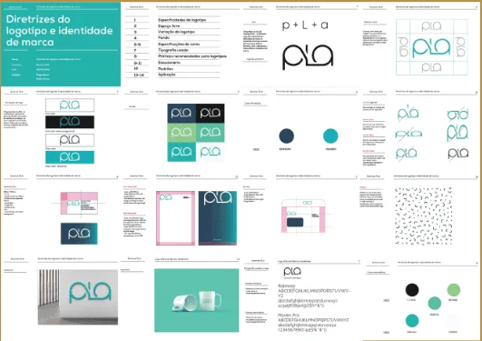
We defined the visual system before any application: logo and variations, palette, typography and usage rules.
We showed the directions in real use, on screen, in a document, in a post, not on a neutral background, because that's how the brand will actually be seen.
The constraint was that the system had to be operated by someone with no design training. That deliberately limited the number of colours, type weights and exceptions.
We carried the system into the website instead of starting from a bought template, so the identity and the website wouldn't end up speaking different languages.
We built a long-form page with a single path to contact, with no menus offering unnecessary choices.
We delivered vector files, templates and written usage guidelines.
We tested the system on the pieces the brand produces most often before finalising the guidelines, to make sure it held up under real use.
We wrote the usage guidelines in plain language, with examples of what to do and what to avoid, instead of a long technical manual.
What I delivered
Complete visual identity and usage guidelines
Vector logo with variations and application rules
Long-form presentation website
Templates for everyday use
Original files delivered to the client
Result
What changed
Every new piece now starts from rules already decided, instead of being designed from scratch.
The brand became recognisable beyond the website: in documents, proposals and posts.
The website stopped being a standalone item and became the main application of the visual system.
The time spent producing each piece went down, because the visual decisions were already made.
The brand gained a clear answer for external suppliers: a document with rules, instead of instructions by message.
This project is mostly Graphic Design work. That page explains what it includes, how it works and what gets delivered.
Want work like this?
Tell me what you need. We talk for 20 minutes, I understand the scope and send you a fixed quote.
Diogo Gomes, Creative Direction · Updated on 17 October 2026
5.0 · 15 reviews on Google